
 We’ve all been places with people who will exclaim, “I like that” or conversely “I don’t like that.”
But going a little further and asking why some things appeal while others don’t is so helpful in learning about design and thinking through our own designs.
Also–and this may be my own prejudice–much of jewelry criticism and/or reviews describe jewelry in rather grandiose terms such as “serene” or “ethereal.” Tseng’s jewelry may be both, but the descriptions don’t help me understand how she got there.
That’s why I often discuss design in these pages. Not to criticize, but to think through why something appeals and why other things don’t as well as to think through exactly those components that form a pleasing or not-so-pleasing design.
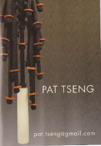
Recently I opened the new edition of Ornament magazine and saw this ad for jewelry by Pat Tseng. (The scanned image does not reproduce the color effectively. In the original, the black is very black, almost vibrant, and the beads which seem orange here are red.)
I think it’s stunning, although the ad (pictured above) doesn’t even show the entire piece. In fact, if I hadn’t known that Pat Tseng makes jewelry I might not have leaped to the conclusion that it is a wearable ornament.
But look at it closely. What’s so appealing about it?
I always start with color. She uses color in a minimal way. The reds are highlighted against the black and the white is the focal point. Any more color would disrupt the color scheme. Any less would diminish the piece. But what is strikingly clear is that although Tseng uses color in a minimal way, she is a brilliant colorist.
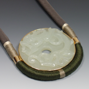 The second step is to look at manufacture. Tseng uses silk wrapped cords to manufacture her jewelry which can be more clearly seen in the other pictures I’ve posted. The color of the silk echoes and enhances the usually very subtle color of the ornament. But, again, the silk cord is minimal in the sense that it directs the eye to the focal point of the piece. It doesn’t conflict with it.
In this second piece, Tseng adds metal. She does this to attach the jade to the silk cord. The jade is bezel set with two bands that slip over the cord. However, in her hands this necessary manufacturing component becomes a decorative element echoing and integrating with the other bands of colored silk in the cord.
Here is a third image of Tseng’s work. Notice the Chinese button knots she uses to separate the elements. The Chinese knots are also used in the first image. They are so beautifully constructed 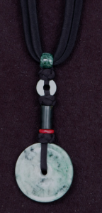 that they become ornaments in and of themselves. Also, notice in the first picture how the round button knots and the round red beads add diversity to an otherwise purely vertical piece.
In looking at these images, there is nothing anyone would add or subtract from any of the pieces.
They are perfect.