Professional Jeweller, a British trade publication, reports that “fringing,” the practice of adding chain and other materials to clothing in the style of the 1920s flapper dress has “filtered” through the fashion houses to be “embraced” by jewelry designers.
Although the term “fringing” is new to me, there is no doubt that over the last couple of years jewelry designers here and abroad are adding fringes to work. Although fringes have been a part of a designer’s arsenal for centuries what we are seeing in this newest iteration is an explosion of different sizes of chain (often) incorporated with other materials to create a kind of mixed media, asymmetrical jewelry.
Much of the commercially produced fringed jewelry is oriented toward younger women. The writer for Professional Jeweller called this audience “urban princesses” and suggested that the new trend is resulting in jewelry with an “edge” or what another writer called “jewelry with an attitude.”
Evaluating design is a subjective response to an object informed by study. That is, a viewer brings his or her prejudices to the evaluation of jewelry (or any other work). If the viewer has studied a body of work, again whether jewelry or another type of endeavor, the greater the likelihood that the viewer can understand and explain his or her subjective design preferences. This of course is a fancy way of saying all of us like certain things better than other things.
Fringes, whether chain or gemstone, aren’t “good” or “bad.” They’re a design element and what counts is how they’re used.
I looked at the websites of the jewelry designers mentioned in the Professional Jeweller article. And while all of them are using fringes, it seemed to me that the work of Zelia Horsley illustrates the best and worst use of fringes.
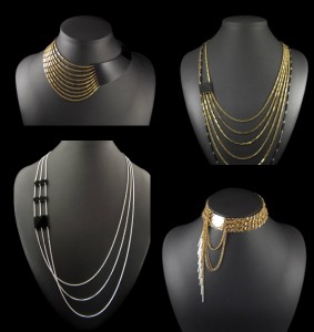
In the picture to the left, I organized a collage of what I consider to the best uses of fringes in Horsley’s work.
The designs are all asymmetrical, but the elements don’t compete with one another. This is especially true of the bottom right picture where the fringe that drapes down from the collar could easily compete with the more dominant element.
I’m not sure if the transition material in the upper right picture is metal or leather, but it helps pull the eye to the multiple strands and echoes the black material used in one of the longer strands to provide a unifying element.
The fringes in the first picture appear to flow from the darker element and are in a perfect balance.
In the lower left photo, the darker elements add a point of interest as do the overlapping chains.
Above all, the pieces are wearable and flattering.
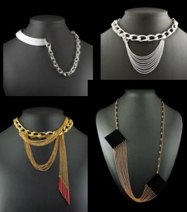
To the left are the pieces I consider less successful. The fringes appear to be grafted on to (as opposed to integrated with) the larger chains and because they are so dominant they compete with them. As a result there is no design coherence. (I do, however, like the addition of red stones to the fringe on the bottom left image.)
The major problem with the piece at the bottom right is proportion and wear-ability. The large element, which in itself is well proportioned, looks odd attached to the much smaller, but long chain.
And, I don’t find the asymmetrical band and chain compelling.
Finally, I don’t think these pieces, especially the one at the bottom right especially wearable or flattering.
“Good design” as I’ve mentioned is in the eye of the beholder. Whether we use fringes in our work or other design elements, our job is not to confuse — or at worst — offend that eye.


